Mapping How NYC Bike-Share Meshes With Jobs and Transit

Hungry for more bike-share maps? Yeah, us too. Thanks to Steven Romalewski, the director of the CUNY Graduate Center’s Mapping Service, we’ve got our fix.
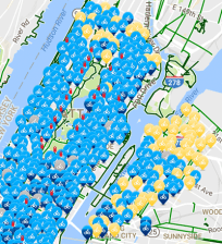
In a post on his Spatiality blog, Romalewski uses GIS to analyze the 413 bike-share stations posted on DOT’s website so far. One map, shown above, shows each station with the size of the station displayed graphically. At a glance, you can see the number of docks per station decrease as you move away from employment centers and subway lines, or into Brooklyn and Queens. For an interactive version, click here.
Romalewski also found that the locations of the bike-share stations tracked the map of the subway system relatively closely — no surprise, since that’s where the density, destinations and demand are. Half of all stations are within one avenue block of a subway station, according to his analysis. Only 21 stations are more than a half-mile from the subway (the furthest is on the Hudson River Greenway, four avenues from the Port Authority).

Check out his full post for more cool data, including the proximity of bike-share to bus stops and how closely station sitings match online submissions for desired bike-share locations
“In general it seems that the proposed kiosks match the overall location patterns of the crowdsourced suggestions, and also support the goal of facilitating first/last mile transportation,” Romalewski concludes. “I was skeptical of the program at first (and I’m still a bit wary of so many more bikes on the road all of a sudden — I walk in fear when I cross a city street, because of cars and bikes). But now that the Citi Bike program is moving closer to reality and the numbers look so good, I’m looking forward to trying it out.”
