T is for Transit-Oriented Development
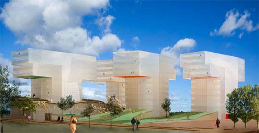
Planning a city around transit doesn’t mean you have to cluster everything inside the core business district. Copenhagen, whose thoughtful bike network we’ve explored elsewhere, recently commissioned Chelsea-based architect Steven Holl to design T-Husene, a place for living and working outside the core city. The architect’s renderings, released November 2, fit into a town that fits into a local rail line and a regional rail network extending as far as Sweden.
It’s an inspiring blend of striking architecture and compact planning. Imagine: roughly 54,000 square feet of apartments on top of 37,500 square feet of retail, with a large allotment of open space. Holl’s design shows how tall structures, plenty of natural light and strategic use of grass can deliver a sense of exploration without sprawl. Says Holl: "It is a sharp contrast to the American urban sprawl which is characterised by highways and endless seas of houses."
It also takes the wind out of the argument that only car-centric urban design can satisfy a yearning for individual expression. This is no Soviet-style block. Again, the architect: "We wanted to create a sense of autonomy, individuation, and particularity for each apartment and tower. One of the failures of modern housing comes from the lack of individualization." Ditto for one of the failures of modern sprawl.
Here are some images:
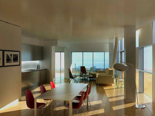
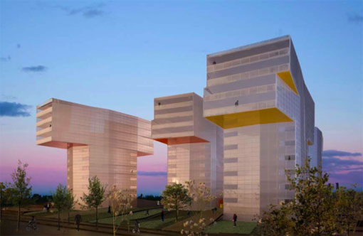
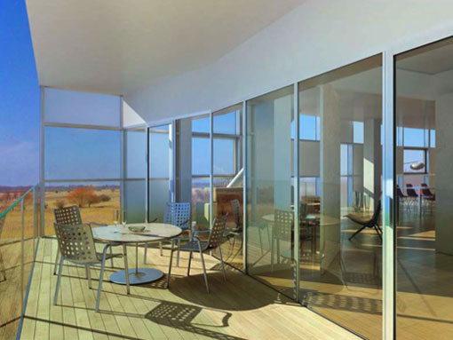
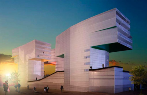
The Copenhagen government chose a strategic site for the project. It sits on a site with a ten-minute rail link to downtown Copenhagen and a direct rail connection to Malmo, a Swedish city. It’s tempting to imagine such lovely forms in the South Bronx, eastern Queens or even New Jersey, with links to airports and office-park suburbs, but it’s hard to move this image beyond fantasy until the city gets serious about concentrating new development near transit hubs in under-built areas.
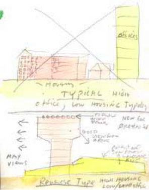
That won’t be easy. The MTA controls most of the transit infrastructure and other entities own most of the land. But there’s a new team in Albany and a new drumbeat for walkable neighborhoods inside and around New York City. Such developments can’t be generic. But as these images show, they can be intriguing — and beautiful.
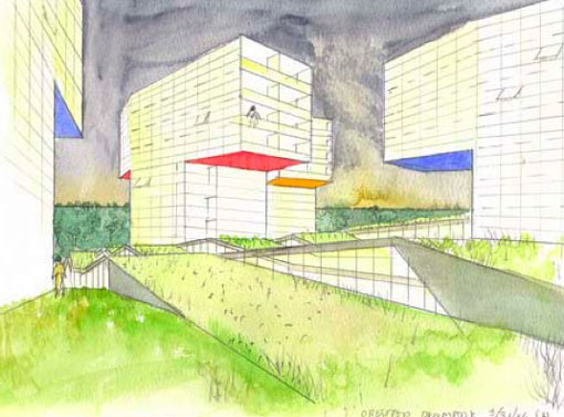
While this looks interesting, how is it different than the Tower’s on the Park models that we’ve seen fail in urban areas?
E-Nut: In a word, context. The “towers in a park” model, following the theory of 20th Century architect Le Corbusier, presumed that people would be most peaceful and productive amid mathematical beauty. Holl, as he says and as his renderings show, rejects this social programming and emphasizes variety of color and light. Moreover, Copenhagen’s planners didn’t erase existing places to impose this orderly model- they commissioned the work in an underused place outside the dense core. So these are towers and there is open space, but to call them towers in a park ignores the variety they’ll draw from changing light, use and flow of people via the rail network.
Alec
Aren’t short, varied, blocks considered the best urban form for walking? These look like kindler, gentler towers in the park and don’t seem too ped friendly. Are there supposed to be retail and restaurants at ground level that make it more interesting?
It looks pretty sterile and dead. Where do people shop? Where do they get a coffee and a bagel, er, a danish, and meet with friends? It looks to me like Towers in a Park, just without the cars and traffic.
The landscape undulations look annoying. The lack of visual details is disturbing. Pedestrians have an innate craving for details which is something motorists could never understand.
Yeah, unfortunately, these kinds of developments cause even greater isolation and fear than the suburban sprawl Holl is criticizing.
This unusable “open space” is really more about celebrating the architecture than anything that is urban or human. Certainly, as Jan Gehl would say, looking at this plan, you can easily see that the architect does not love people.
We actually saw a lot of isolated, dead developments like this outside of Copenhagen during the Jan Gehl conference. It is amazing how some of the worst architecture and development is happing so near to some of the best examples.
In Denver, where they had started talking about Transit-Oriented Development, the focus has evolved to be more about People-Oriented Development. The above is not “People-Oriented”.
The best example that I can think of a failed TOD Development that made the above mistakes is Diagonal Mar in Barcelona:
The link:
http://www.pps.org/great_public_spaces/one?public_place_id=623
I call these “upscale slums”.
Again, it’s a question of site. If somebody paved over an existing neighborhood to create this development, I’d worry. There will be commercial space on the ground floor and different forms of open space. That is, there will be details. As for motorists, the architect says this project caters to rail riders- it aims to create new (and unscripted) relationships between the core and satellite cities. These relationships will be key to urban economies in the next century, and they depend on variety. It’s just as arbitrary to declare that everything must look like the corner of Hoyt and Nevins as it is to put all your faith in rationalist design. This project, however it may look at first blush, doesn’t really do either.
Ethan: I’d be careful drawing conclusions about what species the architect loves. Remember that this project serves an underused place. Insisting on traditional gridded cityscapes where they don’t organically exist can be troublesome, too.
But Alec, whether or not the buildings are sited in a grid, I would think that there would at least need to be a place that is identifiably a “street.” Here there’s no street wall, just needlessly complex topography. Ideologically it may be very different from Corbusier’s plans, but I would expect the experience of using it to be pretty similar.
Alec — That’s not reassuring.
You see something you like here. Are we missing something? It would help to see a plan view, maybe the buildings and blocks are much smaller than they look. It really does appear auto-dependent — even if it is at a commuter rail station.
Folks are talking past each other. It seems like we need to see more detailed renderings of what is planned on the ground – at the base of the buildings and in the open space. If all the commercial and civic activity is in the buildings, if the open space is not useable, if the distances between the buildings is too vast for social interaction to occur, then I still don’t see how this isn’t just towers-in-the-park with nicer architecture. The existing renderings just don’t do a good job of showing this detail and the social aspects you’re speaking of, Alec..
The views, shapes and colors are all distinct. Seems like the project deserves a chance to operate before we dismiss it. All I’m insisting on is that there are many ways to achieve communal space- on an abandoned railroad trestle, in a planned setting, even (consider the celebration after the NJ Devils won the Stanley Cup) in a parking lot. Anybody want to approach the architect about getting into a live chat about this?
Intentions may be good but all I’m saying is that this looks like the kind of design and architecture that, typically, fails entirely at achieving anything remotely communal — it don’t matter whether the colors and shapes are distinct.
Maybe residents will chat with each other on the train on their way to work in Malmo.
T is for Towers in the Park.
The Soviets built lots of high-rise suburbs served by train and bus but they weren’t what we would consider TOD these days – more like Starrett City with a train.
This definitely looks like something slated for Brasilia (ever been to Albany?). I think the urbanists have this guy’s number.
I would not want to live there. I like interesting and varied streets with retail at my doorstep and parks nearby, not the other way around. It is nice that it’s near rail lines, but otherwise, it doesn’t seem to create a very walkable space.
Somebody direct the architect, Holl, to this discussion! He might develop his ideas more.
Since we’re all consultants on this project now, I’ll weigh in, too! Maybe some space set aside for community gardens in the open spaces would be good. Maybe a playing feild or two?
Ultimately, the architecture of the buildings is a lot less important than the larger design that governs the use of the space.
Having easy, walkable access to rail is excellent. By itself, however, that doesn’t make for a people-oriented space or provide social interaction. People need to be able to walk from their apartments to retail locations – and not malls, but things like grocery stores and corner stores, dry cleaners, coffee shops, restaurants and bars, etc.
Rail access means people can get to work without a car. The other stuff means they can live entirely car free. Not sure, however, if that is the goal here.
It looks like a scary, imposing place, with the large blank walls looming over you and the T of the towers directly above. It’s a shame that they are wasting a perfectly good spot on the Øresund line for such a horrible holdover of modernism. But I think that no matter what architect they hire to plan this place, and what philosophy the architect uses, it still will not come out to be an urban environment. The city arises not from the mind of a single architect, but from the many individual ideas and interests of many individuals. I think the mistake here is in thinking that a city can be planned down to that level of detail and still be a livable city.
Would the architect want to live in these towers he’s designed?
Let me take a guess. We know that he works in Chelsea. Chelsea offers a varied and diverse streetscape with opportunities for all sorts of interaction and a variety of uses. It’s an exciting place to be. There is a reason creative and smart want to live and work there. This place looks like an updated version of the Corbusian Parisian suburbs where ghettoized young people are rioting against the police.
It’s not just the form of these towers that is the problem, it’s the idea that they’re all built identically and simultaneously. As Jane Jacobs said, you need microscopic investment in a place for it to grow organically, not cataclysmic investment that creates monotony and regimentation.
Transit-oriented development per se is a fantastic concept and one we as a society must pursue. To me, these pictures show that it can be done wrong however.
Why not try it out and see if it works? Because real people will wind up living here. We’ve tried Towers-in-the-Park already, and it has been an abysmal failure.
The towers aren’t identical, and I regret that the writing fails to make that clear. The unit layouts and play of light in each building distinguish them. I wrote about this because I thought it’d be provocative, and I’m glad to see how right I was. But how much respect do we give urban experience when we embrace any orthodoxy? Jane Jacobs proposed one model, with virtues and soft spots and elisions. Le Corbusier proposed another. A new age, demanding sustainability and incorporating digital communication, demands new models. Those models have to experiment with all available precedents, or we’re just making copies. And copies fade. Right?
My initial reaction to this is cautiously negative, and I’ll explain.
Let’s say I live here, and I come home from work. Sure, there’s a park all around my building, but what am I to do there? with the rolling hills and dropoff walls, it doesn’t look like a great place for many sporting activities.
But that’s OK, personally I’m not much of a sportster. I like to go out for a drink or walk along shops. But I don’t see that here. The buildings say to me: “Go upstairs and watch TV. Read some blogs. Goodnight.”
The reason I’m cautious about this negative reaction is the line that says:
OK, so there’s retail in those buildings, presumably in the first few floors of each one. OK, so each building is like a little community, and presumably, if the space on the retail floors is designed well, people will be able to walk around there, hang out, meet their neighbors, and just live, as in a mall (without the need to drive to the mall).
Sounds good, if the space for the retail area is designed well. If it’s just a bunch of office space, or has people-unfriendly halls or storefronts, that’s different. I guess, as some have said, I’d have to see the floor plans and mock-ups of the insides, particularly the retail areas.
Depending on how people will be interacting with each other and the retail space, it could be interesting or just another boring tower.
Oh, and flatten out that park so people can use it… As it is it looks like it was designed to be “interesting” from a car…
On the optimistic side, having lived in Queens for two years near LeFrak City, I will say this: this design seems a vast improvement over projects like LeFrak City. Somewhat related to that, at some point the design of the project stops mattering and the economic policy that affects the people living in it matters more…
The picture reminds me of the set for “Teletubbies.” Maybe it will look different when they actually build it.
Okay, so the unit layouts and play of light are different. That still doesn’t allow for much individual expression. It’s multiple choice creativity: an oxymoron. “The architect gives you these 4 carefully and brilliantly thought out choices. Pick one. That’s all the creativity you get.”
The description of the project on Steven Holl’s website leaves me even more baffled:
A green folded space with multiple elevations on top of the commercial space is sliced open by the insertion of the five rotated dancing towers. With this project Steven Holl Architects sets a new example for residential typologies based on the concept of urban porosity. Leaving behind the standard typology of residential perimeter blocks, the dancing T’s with colored and reflective undersides carve the sky within the green folded space.
Inspired by twilight and the Scandinavian sky, the T-shaped buildings maximize high quality residential floor space with views to the horizon and sunset. Building downwards from the maximum height level, taking into consideration maximum view, each tower will contain 50 apartments in 22 different configurations ranging from 73 sq.m. to 135 sq.m. At the same time, the working environment of the commercial area is improved by the green folded landscape, allowing the nature reserve to flow from the Amager Fælled through Ørestad onto the green square in the east.
I’m not a designer or pretend to be one…for me, from the renderings, it seems just about everyone above has made a valid point or suggestion.
I will add, however, that it looks like a scene from some mysterious Coroporate HQ in a future “Rollerball” or “Logan’s Run” movie.
The greatest issue with the towers-in-the-park was who felt “ownership” over the public space. As Adam so observantly noted, the blank open spaces drive you inside- there’s nothing to anchor you to the outside. This is the designer’s idea of freedom, but as Jane Jacobs noted, parks designed for specific activities usually do better. So there are these vast spaces with no activities in them and they’re not clearly the property of any specific building. So the rules of play in the public space aren’t clear. People like familiar forms, or at least forms that suggest why they are there and how they are to be used. Blank open spaces drive people away. This project would be a huge mistake.
Yes, Bruno got to what I was feeling better than I did. The space needs to define what you can do there and this space doesn’t really suggest anything that people might do but look at it and move on.
However, as with the insides of the buildings, we’re also not being shown the larger surroundings of the development. If the land we see rolling and dropping off immediately around & under the buildings is not the full park, but merely the base for the towers – that is, if there is more park that we’re not seeing with traditional park space & flat land – then it could be OK. The buildings would just be separated from the park proper by landscaping, which could be a good thing as such a glass structure like that might be a bit averse to having lots of park activities right next to it, which usually involve throwing and other sundry potentially damaging activities.
I appreciate the creative effort but it seems as if designers of tall structures always look at them from the position of a human being looking at a small scale model.
If you think about what it would be like to be a person trying to relax under those looming overhangs, or enjoy the out of doors, I think this buildings begin to look absurd. Far from creating live space for people, these buildings seem to carve out extra dead space all around them.
The first 10 feet of height above the ground are everything for people oriented design… and as is usual, these buildings offer blank walls… with the added deterent to human interaction of omninous overhangs.
Furthermore, what is the context? In one picture they seem to rise out of a bucolic landscape….. no other buildings around. Really? Is that how hey will be situated?
Finally, this is not a criticism, but based on the pristine interiors, these designers have no idea what it is like to live with children. But designers rarely do, do they? It’s just amusing. The whole thing seems to be a fun and creative fantasy divorced from pedestrian life and life with children and … well life itself.
I enjoyed looking at them!
“The whole thing seems to be a fun and creative fantasy divorced from pedestrian life and life with children and … well life itself.”
Such a shame these fantasies get built in the real world as often as they do. This is another one best left as a “vision.” Puh-leeze don’t build this!
As I’ve said, the sort of linear urban experience we cherish in New York City doesn’t translate everywhere. (Ever been to the pedestrian-only mall in Poughkeepsie?) Even if we all knew that Jane Jacobs’ approach supervened all others, though, what do we gain by getting snide? Architects bring professional expertise and artistic sincerity to specific sites. If anyone in the above discussion knows the site or knows Denmark, please amplify your conviction that this project doesn’t fit it.
Where’s the corner newsstand? Where’s the corner falafel joint? For that matter, where’s the corner?
Seriously, this thing is an office park with condos perched on top. I’ve been in a hundred layouts like this just as sterile and car oriented. And a transit stop nearby doesn’t change that.
I don’t understand the vitriol. We don’t know the site, or the neighborhood, or the local appetite for falafel. Are the Streetsbloggers really saying that the only kinds of urban experience worth trying are the ones we already know? If so, how do we address different economics and land use patterns and traditions around the world?
This is typical of architects. Their highest goal is to make a unique artistic statement, not to make something that is usable or workable. This can be a problem when they are designing an individual building, but it can be a disaster when they are allowed to plan an entire area.
I don’t think it’s fair to ask if “the Streetsbloggers” are “really saying that the only kinds of urban experience worth trying are the ones we already know?” I think, quite the contrary, many of the reactions here have to do with the ways this actually seems similar to quite a few projects we are familiar with.
People are saying this doesn’t seem to really be doing anything differently, and have asked for clarification. The only thing added so far is that the “unit layouts and play of light” is unique – but how does this correspond to creating public space or anything else related to any sort of “Streets Renaissance?”
I also feel this project just doesn’t seem as innovative and amazing as the post suggests, and I’ve listed questions & comments about what I think seems wrong but may not be if more was known.
As you say, “We don’t know the site, or the neighborhood, or the local appetite for falafel.” Exactly. And some here have asked for more information about just those sort of contextual details. Perhaps it’s the context that makes this innovative and exciting? Something more than just being near a rail line?
It seems there just isn’t enough information available about this, but in that case it seems less excitement is warranted.
If the only choices are sprawl and this, I guess I’ll take this, but are those really the only choices? And as the designer says he wanted to create a “sense of exploration” – is that really what we’re missing from our residential areas? I’m usually looking for that when I go on vacation, not where I live.
The main positive seems to be:
Which is all fine and dandy but then that seems like it would be all about the insides, not the outsides, and there’s only one image of what the inside is like, so it’s hard to understand what is meant.
The whole thing just seems a bit strange for a site dedicated to Streets Renaissance.
Does the main excitement merely come from the fact that this isn’t a traditional suburb, but instead a suburb squashed into a mall?
From looking at the site more, though I can’t read the language, there’s a picture of a woman in exercise gear, so perhaps there’s a built-in health club? Interesting. I wonder if it has innovative design, too?
I agree with most of the criticisms that say this is as sterile and inhuman as a 1960s Tower-in-the-park housing project – with T shaped buildings instead of conventional towers so the architect can prove how innovative and cool he is.
One additional point: A design is not pedestrian-oriented if the sidewalks face the unused grass landscaping surrounding the buildings, as they do in these renderings. Pedestrians are attracted by people, and sidewalks attract pedestrians if they have human-scale housing or shop windows right next to the sidewalk.
Jan Gehl of Copenhagen pointed this out many decades ago. It is too bad that there are still architects in Copenhagen who have not learned this fundamental lesson about how to design livable cities.
This project is a sad result of the current trend to avant-gardist architecture that concentrates on being new and different to attract attention to itself.
Alec, you’ve stumbled right into the debate that architects and planners and urban designers have been fighting amongst themselves for years. We (the planning side) are about making the spaces between the buildings work, and architects (for the past fifty years particularly) been obsessed with creating striking forms and interiors and ignoring the public realm. Granted, they’ve also been plagued with bad zoning and codes that make them do things like set their buildings back from the sidewalk. But knowing what we know in this day and age, it’s criminal to design something like this anywhere. The towers-in-the-park model, which this resembles more than anything, has failed all over the world. Only in a few locations (parts of Paris, Brazilia) have residents managed to overcome the obstacles and make it work. There’s no reason not to meet the street- it just works, and you can design all kinds of modernist, fun designs on top of that.
Charles – in Alec’s (or the architecht’s, or Denmark/Copenhagen’s) defense, the architect is an American, from Chelsea, according to the post.
#39: Bruno, thank you. Although I have to say my friends in Brasilia would disagree. They ALL, uncategorically, HATE living in Brasilia. Hate it. Would give anything to live in Rio or even Sao Paulo, if they could just make a living there!
#40: Adam, yes the architect is “from” Chelsea. One could say, “chooses to live in” Chelsea. And Chelsea is WAY different from this.
Alec: please stop trying to defend this monumental piece of crap.
Thanks to Bruno …for a nuanced, patient and
whatever-the-opposite-of-ad-hominem-is critique. I’d love to learn about cases where planners and architects unified with clients and neighbors to produce something urban. I think Paris Plage counts, but I’d love to learn more about conditions that make such harmony elusive. Does anybody want to stop the sniping and discuss a model development? Thanks, guys.
Please look into the context of this project before making preconcived assumptions.It’s situated in a new development area called Ørestad South. The project exsist in between upcoming perimiter blocks, to the north and south (therby stands in contrast to these), and bridges between a town square to the east and vast fields of nature on the west. The project is also to be developed in phases, the images shown is the first phase before the rest is built up. For further reading on the context of this project visit, “http://www.orestad.dk/index/uk_frontpage.htm”)(in english), “www.t-husene.dk” and “http://www.orestad.dk/index/privat/nyhedsbrev/orestad_syd_karreplaner.htm” (in danish).
Thanks.
Just checked your links to check the context, #43, and yeah: this is better than Brasilia. And it is better than sprawly American suburbia. It still seems, however, sterile and banal and car dominated. Check the “shopping” tag: there is one location for the entire development (ditto the “restaurant/cafe”)…and it seems to be a mall. Lovely. So glad I don’t have to live like this. You offer this as an alternative to sprawly American suburbia. Why not compare it to another Danish city? Have you ever been to Copenhagen? It is a wonderfull pedestrian-friendly place. Why not design something that is new that compares well to that? Sorry. A discussion of this development does not belong on Streetsblog. No “streets renaissance” here.
I have actually experienced the “context” of this development several weeks ago in Ørestad. Unfortunately, the context is essentially an architecture park, where all of the designs not only ignore context, but deliberately avoid creating any context. Granted the master plan for this new section looks a little more cohesive than the above images, the area is still more about the buildings, designs and private interior spaces than the street, public gathering spaces and people. Most of the new buildings going up in Copenhagen , and around the world for that matter, make many of these mistakes.
Frank Gehry has been quoted saying “I do not do context”, and disappointingly, that is the sentiment guiding most of these self-proclaimed “concept-driven” designers. Coincidentally, they all seem to be the designers with buildings featured in car commercials.
To me there is a continuum from “concept-driven” to context driven (or in case of new development “context creating”) with “solution-driven” and “context-sensitive” in-between. Most progressive planning is still falling in these middle areas.
PPS is currently working all over the world facilitating developers, architects and communities to start with a vision for the public spaces and the community context. There was actually an article in Urban Land Magazine (ULI’s mag) this month about our unique approach.
Fantastic debate. I often think that people dismiss ‘towers in the park’ because they think of public housing projects instead of luxury apartment buildings in places like Lincoln Park, Chicago.
There are, in fact, people who do enjoy living the high-rise
lifestyle. Judging all ‘towers in the park’ by examining only the failures is
a bit like judging all ‘pedestrian oriented’ neighborhoods by studying only
slums. There are places where high-design towers are popular and pleasant to
live in — one should not dismiss this project because of its type.
In the same vein, simply because a development is transit
oriented doesn’t mean it will be beautiful or successful in terms of quality of
life — many are enormous failures. See Pyongyang: http://www.orientalarchitecture.com/pyongyang/pyongyangstreetsindex.htm
I’m inclined to agree with the comments suspicious of this
project, but not quite so scathingly. I’m not opposed to the construction of
more ‘towers in the park,’ but the most successful high-rise housing developments
are at the edges of parks, not in their center. I’m curious to see how the
designs evolve.
Josh, you’re confusing "towers-in-the-park" with just plain towers. Highrises are great, they just need to meet the street. Highrises bordering an official city park usually work as well, because the city has ownership over the management of the park- the rules of behavior are clear. Setting a highrise in an open, green space creates a no man’s land. And you’re right, there have been a lot of failures designing TOD. The organization I work for, Reconnecting America, has done a lot of research into those failures and has a lot of recommendations for better TOD. I think we’re going to see more and better TOD in the years to come.
From the concept sketches it appears the commercial street is underground, creating a greensward roofing. Arguably, all roofing should be green in the future.Talking about the streetfront of shopstalls is great, but when you look down on such a street, you see roofs and streets. Not too inspiring.The wide-open spaces of the parkland maybe should be judged in terms of people who use bicycles and walk more than we do. A campus that is simply too large for a pedestrian can be just the right size for a bicyclist.And, of course, there is the possibility that transit will make accessable features such as traditional streets not actually found at the site.
Instant slums
Great discussion. I’ll try to applify what has been said by highlighting a point: it often seems that many architects don’t understand that the fundamental unit of urban landscapes is the human body. Streetsblog is predicated on this understanding, after all. We experience space in relation to our persons. And if it seems like non-architects are unwilling to experiment with urban forms, I’d agree that is true, but with good reason – the human form is more or less static. We’ve gotten comfortable in urban environments over the course of thousands of years. The things that worked evolved naturally over a long period of time. When doing urban planning, many architects seem pre-programmed to try to reinvent the wheel perpetually, because they approach their profession as if it was a fine art and not a craft.Jane Jacobs did not "propose a model" so much as she masterfully articulated something that people had long sensed intuitively, despite years of modernists and other "experts" and "professionals" telling them not to trust their own instincts.People are hestitant to try new "models," and with good reason. We’ve been burned so many times. Especially at this late point in time, the onus is on the architect to explain how this project will overcome what we know are the severe drawbacks of the "tower in the park" model. Variety in the colors and shapes of the buildings is entirely beside the point, as so many posters have pointed out with acuity.I’d like to see an example of where "insisting on traditional gridded cityscapes where they don’t organically exist" has been "troublesome."