NYC DOT Shares Its Five Principles for Designing Safer Streets

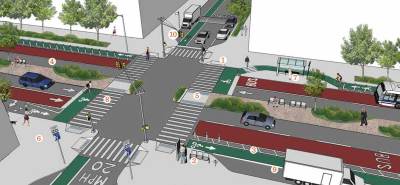
Earlier this month, NYC DOT put out a major new report, Making Safer Streets [PDF], that collects before-and-after data from dozens of street redesigns and distills five key principles to reduce traffic injuries. The excitement of election week overshadowed the release, but this is an important document that livable streets supporters will want to bookmark. It’s an accessible guide to how DOT approaches the task of re-engineering streets for greater safety.
Under Commissioner Janette Sadik-Khan, DOT has elevated safety as a departmental priority, and it often follows up a redesign by reporting on the change in traffic injuries after six months or a year. After six years of implementing these projects, the department now has an especially compelling data set – multiple years of before-and-after safety records from dozens of redesigns. Reviewing these projects and what has worked best, the report authors distilled DOT’s approach to safety improvements into a design philosophy.
Deputy Commissioner for Traffic and Planning Bruce Schaller, the lead author, says Making Safer Streets is “the most comprehensive data-driven report on safety we’ve put together.” What makes it especially notable for New Yorkers and residents of other major cities, he said, is its focus on urban streets. “When we look at safety and the elements of design that make safe streets, [other studies] are still not a clear guide to what we should expect to work in NYC.”
The DOT team hopes the report will serve as a reference not only for planners and engineers, but for any city resident who cares about street safety and wants to evaluate how streets are functioning and what would make them better. It’s written in accessible language and comes in at under 30 pages, with a raft of graphics and photos doing much of the communication.
The guiding idea in the report is that greater simplicity, order, and predictability will make streets safer:
The fundamental characteristic of the successful projects is that they create the opportunity for drivers, pedestrians, and cyclists to move through the street network simply and easily, minimizing the unexpected, the confusing, and the potential for surprises.
Innovations that DOT is known for — protected bike lanes, pedestrian plazas — are in this guide, as are standard engineering tools like signal timing and turn restrictions. These are all framed as “treatments” to be used in service to five broad design approaches.
The report is structured this way to make the recommendations useful in multiple contexts across the city. “Whether you’re in the heart of the CBD or the outer boroughs, the treatments will change, but the approaches — these five basic findings — apply across the board,” said Schaller.
Here are DOT’s five principles – to get a good sense of how they mesh with design and engineering treatments, open up the full report [PDF]:
- Make the street easy to use by accommodating desire lines and minimizing the complexity of driving, walking, and biking, thus reducing crash risk by providing a direct, simple way to move through the street network.
- Create safety in numbers, which makes vulnerable street users such as pedestrians and cyclists more visible. The same design principle, applied to arterial streets when traffic is light, reduces the opportunity for excessive speeds.
- Make the invisible visible by putting users where they can see each other.
- Choose quality over quantity so that roadway and intersection geometries serve the first three design principles.
- Look beyond the (immediate) problem by expanding the focus area if solutions at a particular location can’t be addressed in isolation.
Schaller contrasted this design approach — with its attention to actual human behavior — with the old engineering habit of creating maximum vehicle throughput and maximum flexibility for motor vehicle traffic. Making way for travel behaviors that only a small minority of people engage in leads to chaos, confusion, and danger for everyone on the street. “The traditional approach is you create as much capacity as you can, and accommodate every possible movement through an intersection, allowing people to choose whatever path people want to use,” he said. “It’s more important to design for how people use the street than to design for every possible type of movement.”
Adding features for safer walking and biking can be the yin to the yang of simpler driving conditions. Schaller gave the example of eliminating a left turn for motor vehicles, which goes hand in hand with additional pedestrian crossing time. “You simplify the intersection, then you can accommodate the major movements, and then you have time to add [a pedestrian head start].”
Incorporating safety as a core design goal, Schaller emphasized, can be the foundation for achieving other outcomes. A street where people feel safe, after all, is a street where more people want to be — hence the link between DOT’s safety overhauls and better retail performance. Safer streets also make more efficient modes of transportation appealing to a broader cross-section of people, sometimes changing travel behaviors to the point where it becomes easier to move ahead with a second iteration of the redesign. Schaller cited the example of Second Avenue in Gramercy, where a buffered bike lane was converted to a parking-protected bike lane a few years after the adjacent blocks received the more robust safety treatment. DOT felt comfortable reallocating that space since motor vehicle volumes had dissipated following the initial redesign.
“As you design for safety, you not only get safer streets, you also get better quality of life and more economically vibrant neighborhoods, more people on the streets,” he said. “Sometimes you think of safety in terms of tradeoffs, as a zero sum game, but what we’re seeing here is that improving the functioning of the street can be good for everybody. Good street design for safety furthers all users.”
